IMDB
(There's a lot of dead space in most modern sites, so this is the only 'now' screenshot that displays the site in full.)
Then
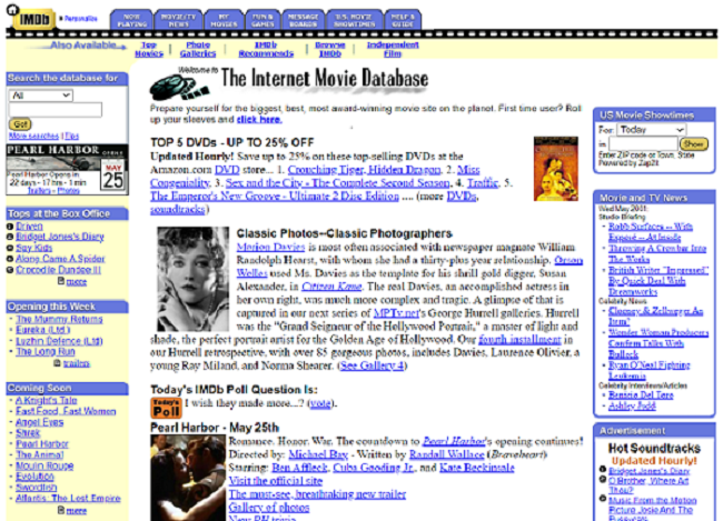
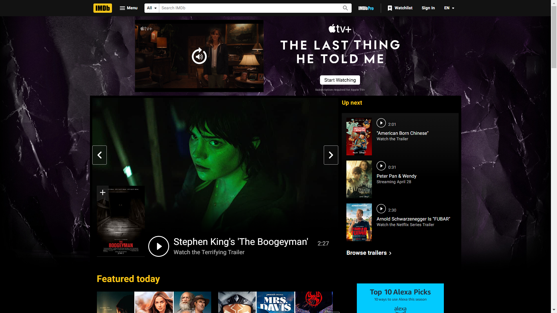
Copyright 1990, IMDB is one of the OLDEST websites to remain, let alone exist. The name is short for Internet Movie DataBase. Earlier on, the site also showcased movies of the past as well as the current theater flicks, hosting trailers for WWII-era war movies. They also used to have a message board, sadly unavailable today. Message boards were an integral aspect of the Old Web, as they served as the precursor to social media. Whereas sites like YouTube or Tumblr or Reddit are nowadays used to congregate over any potential common interest one might have, there was no such ‘mecca’ in the days of the Old Web. Every individual topic would be discussed on an individual website. Therefore, if you like movies and wanted to talk about them, your best bet would’ve likely been those message boards on IMDB.com
Now
The site today is very different from IMDB then. One of the main differences is the lack of textual information on the main page. It’s mainly composed of posters, as though people generally come to the site nowadays for a specific movie, then immediately leave. No lingering is encouraged. There are no more polls, no quotes of the day, no newsletters. However Actors’ birthdays are still listed on the main site as well as the films at the top of the box office, and for the birthdays they include photos of the individuals alongside their names.
The Onion

Then
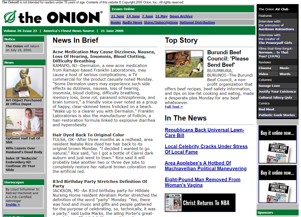
The Onion’s presence on the Web hasn’t changed all too much, as its core concept of satire means that it presents itself as a perfectly legitimate-seeming new/s source with bat-shit insane articles. Ironically, its site in 2000 seems ahead of its time in comparison with the Washington Post’s site of the same year. The Onion features a much simpler color palette, green on white, than the Post’s dusty blue, mustard yellow, and vomit green.
Now
In the modern era, the Onion still presents that facade of professionality and journalistic integrity. The sites are designed with a sense of minimalism, employing much less use of color than before, with the Onion using the green accentuation now to accompany some element of interactivity; hypertext, buttons, and the ‘Onion’ logo itself. Today, most articles on the site have accompanying photos, further amplifying the satirical aspect of the publication by either playing up the insignificance of the article or the abnormality of it. For example, in one article titled ‘Invisalign Begins Offering Clear Body Shell System To Gradually Straighten Posture’, a woman is pictured smiling in a sarcophagus-esque clear case. Also, in the modern era the Onion also parodizes Buzzfeed with its Clickhole site.
Apple

Then
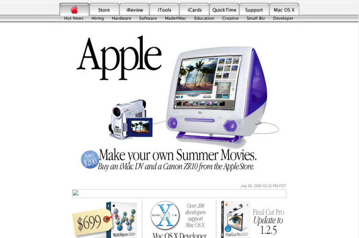
Since 1998, internet connectivity has been a central aspect of Apple’s branding, and on the site, it shows. A capture in 2000 shows how online purchasing was present even then. Oddly enough, the ‘Apple’ logo is bright red on this version of the site. Importantly, at this time, Apple’s new design philosophy ‘Aqua’ was being integrated into their computer software, evident in the website itself. It can be seen at the top menu bar, and is visible in the colorful jelly bean ‘buy now’ button. Furthermore, the site is very ‘white’, perhaps done to convey a simplicity or purity to Apple’s product line. Fun fact, aside from the odd computer cube and wireless router, Steve job’s desire for the Apple product line was to be as streamlined as possible, with four options: a consumer stationary option (iMac), a consumer portable option (iBook), a professional stationary option (PowerMac), and a professional portable option (PowerBook)
Now
One bigger change is that Apple markets its software incredibly less on the site, likely because software updates are downloaded over the internet instead of through purchasable optical discs. Furthermore, the kind of people who would purchase things like Final Cut Pro either already have it or don’t want it. Aside from that, the product marketing on the site has substantially increased, taking on a cinematic style all throughout the site. Each page tells a story through scrolling. Interestingly, now the only colorful and bright elements on the site are in pictures of the products themselves, and the rest (other than clickable links and ‘new’ tags) of the site is monochromatic.